PROCESS WORK
In order to begin the process, simple object studies analyzing the effect of lights and shadows were completed. As the form of the object was studied, various directions of emphasis were explored.
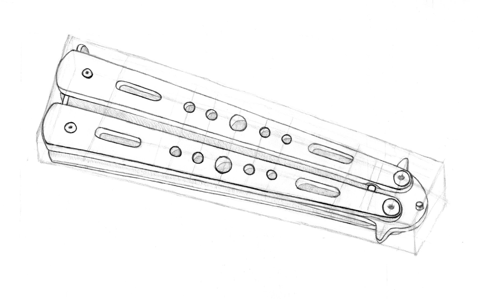
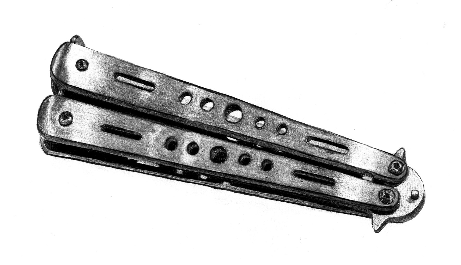
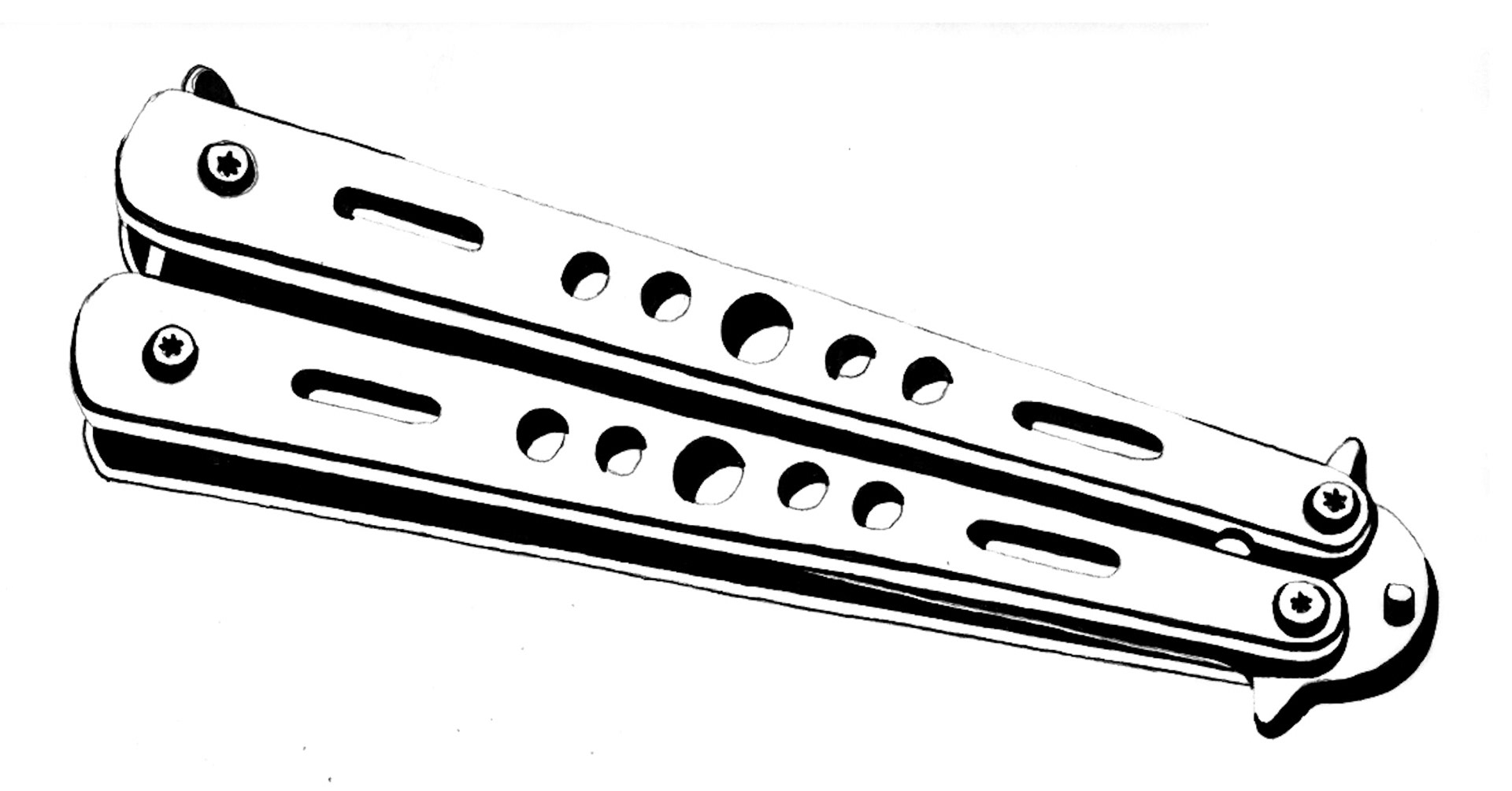
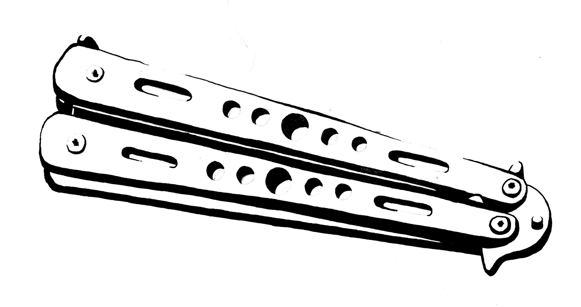
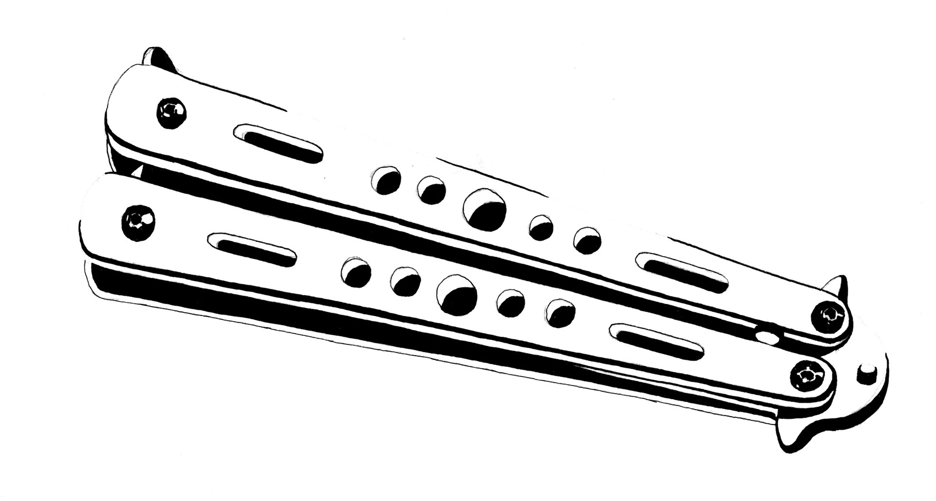
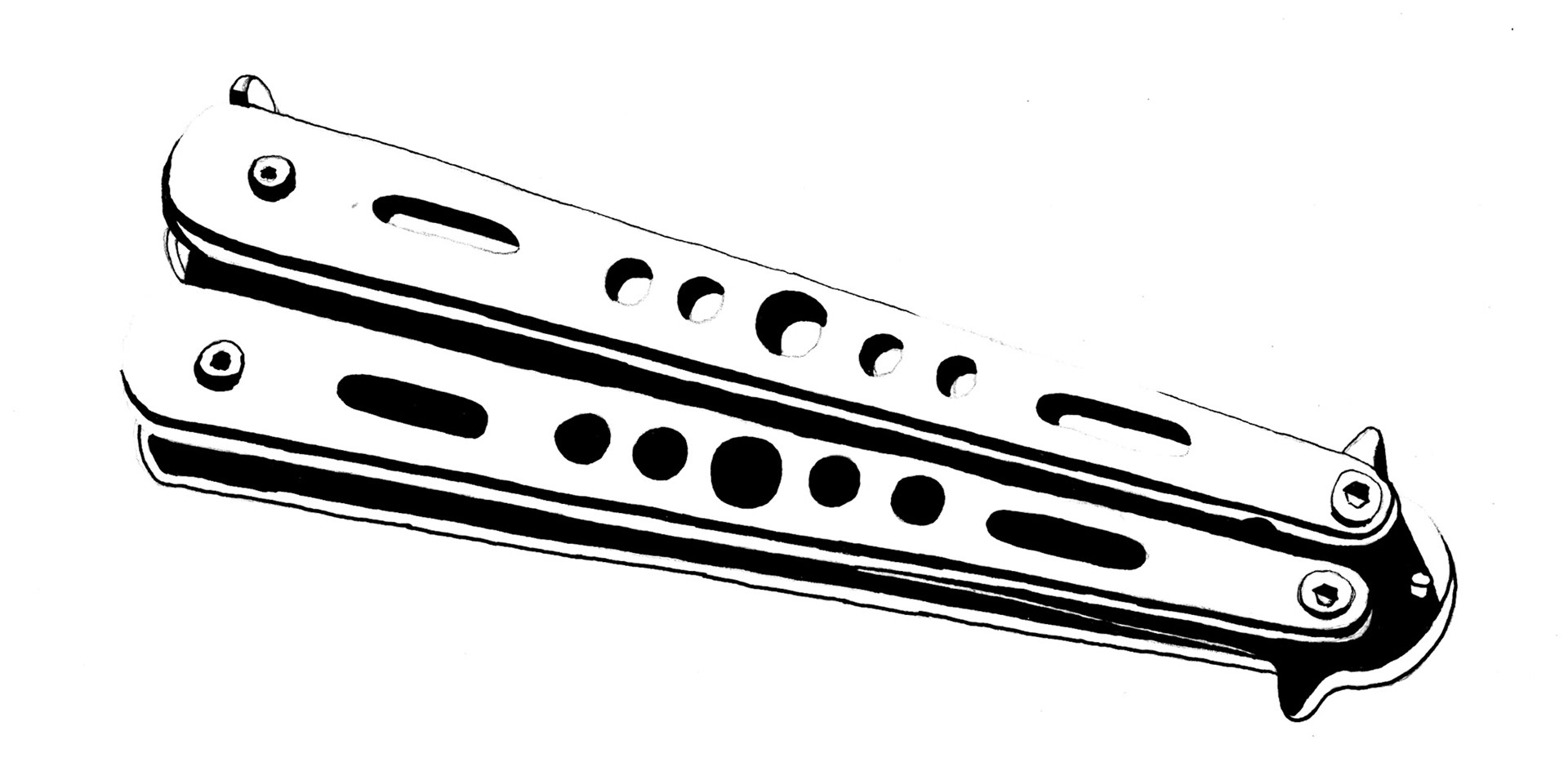
Preparations for the icon creation began with iterative sketches on paper ranging a variety of options. The finalized icons should effectively express the purpose of the object. At a glance, the viewer should understand what object is being depicted and how its composition relates to its purpose or unique features.
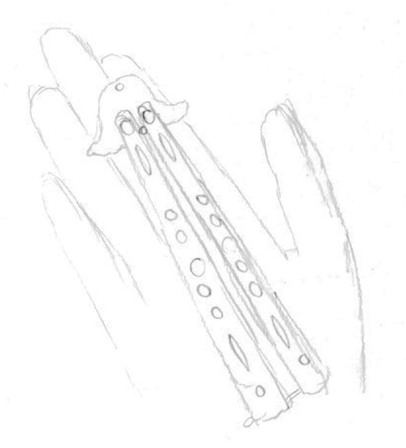
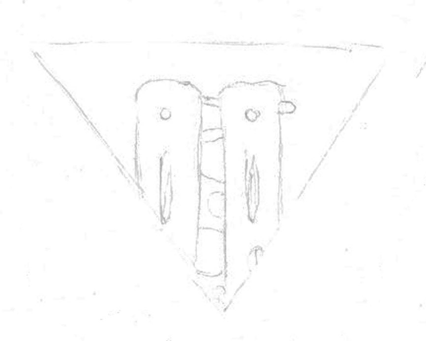
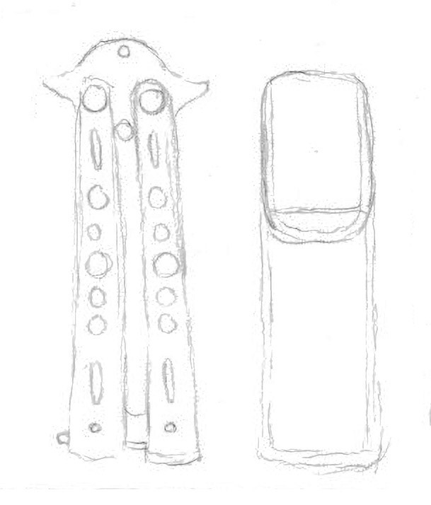
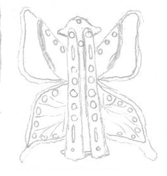
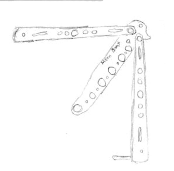
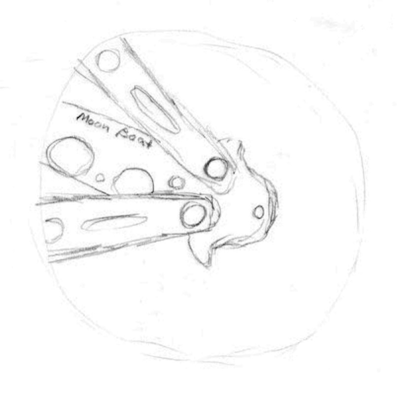
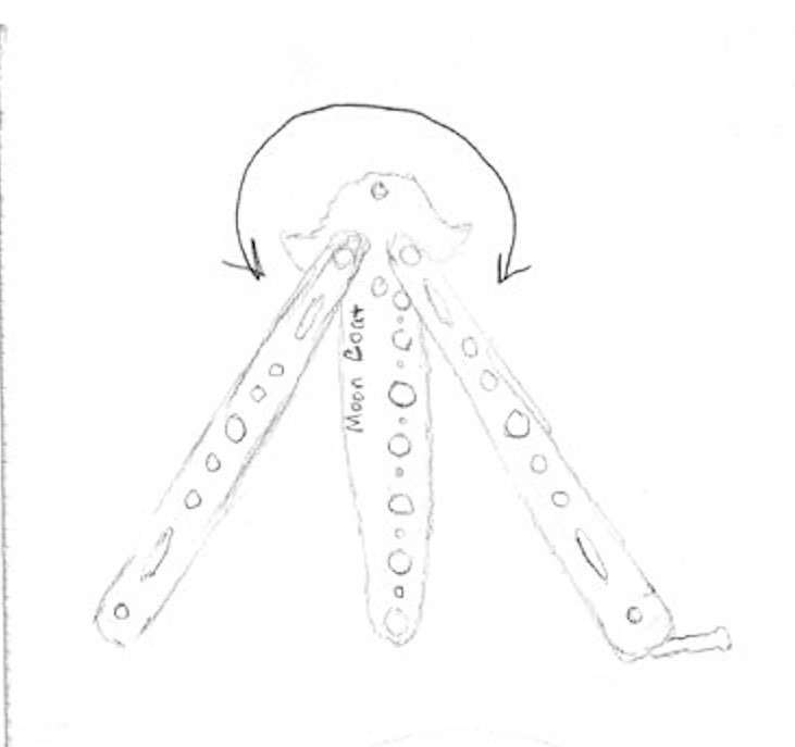
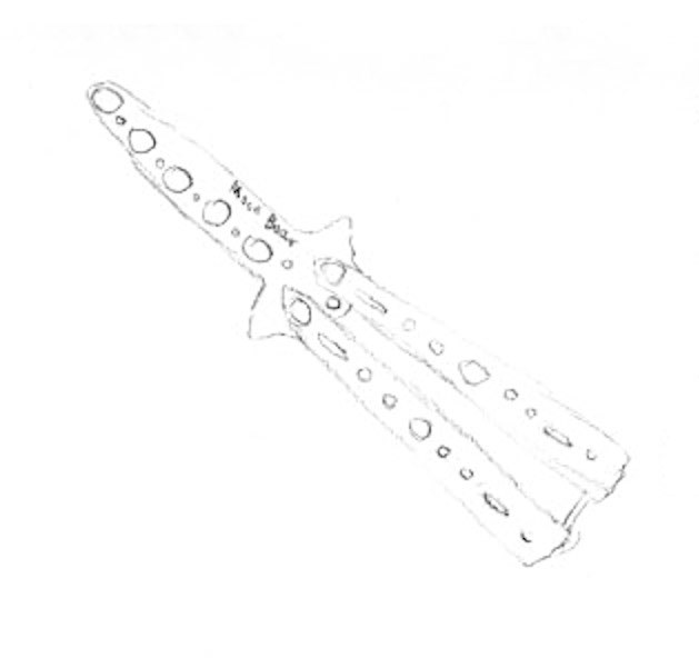
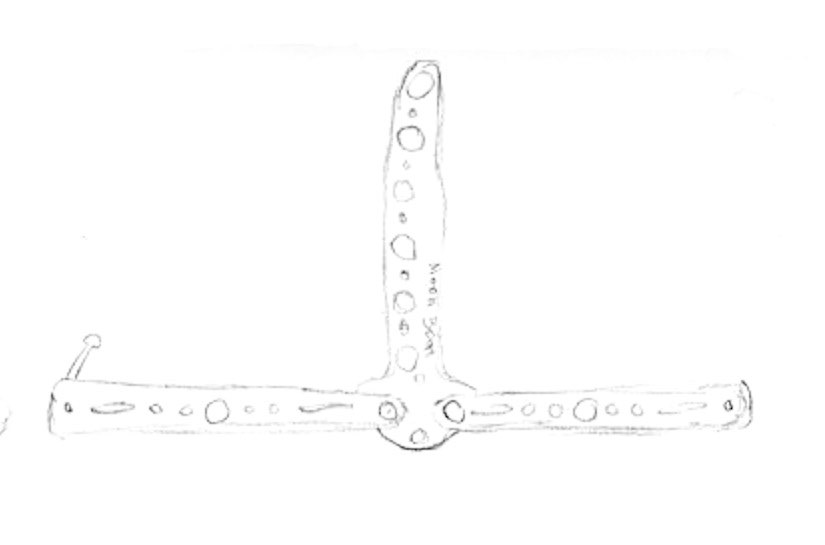
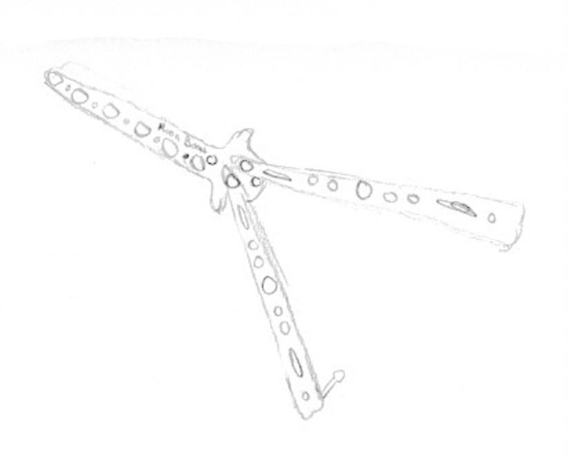
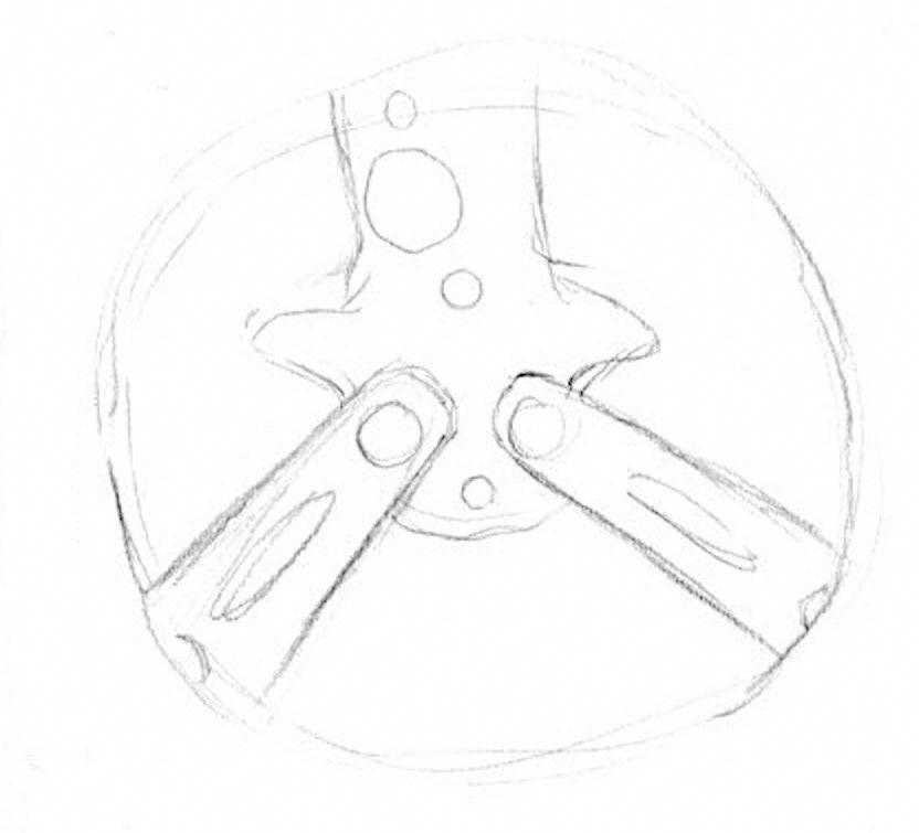
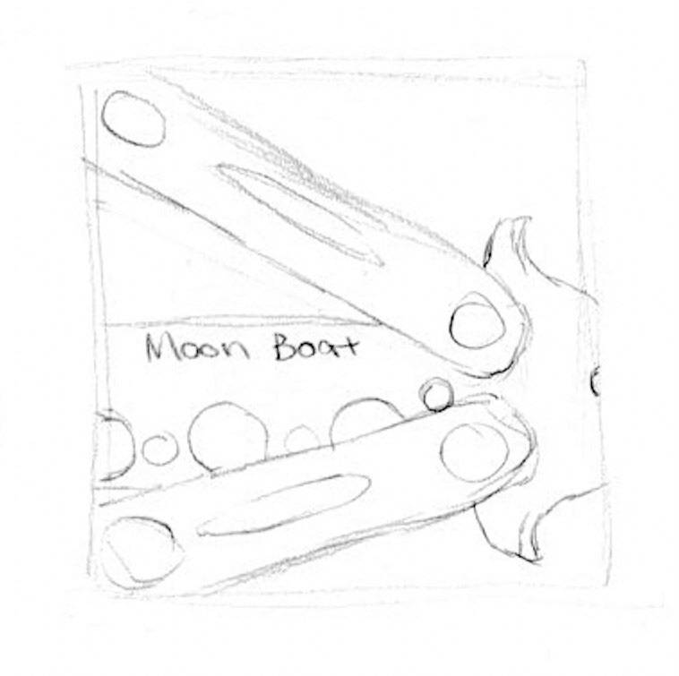
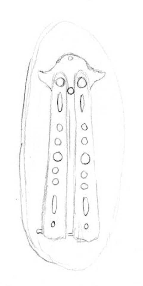
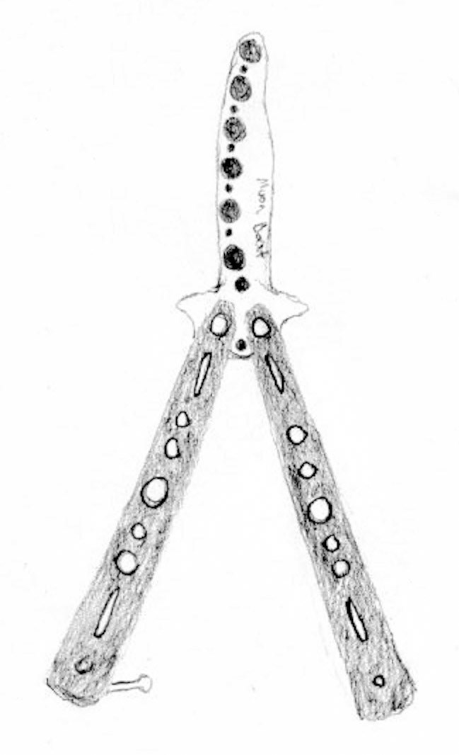
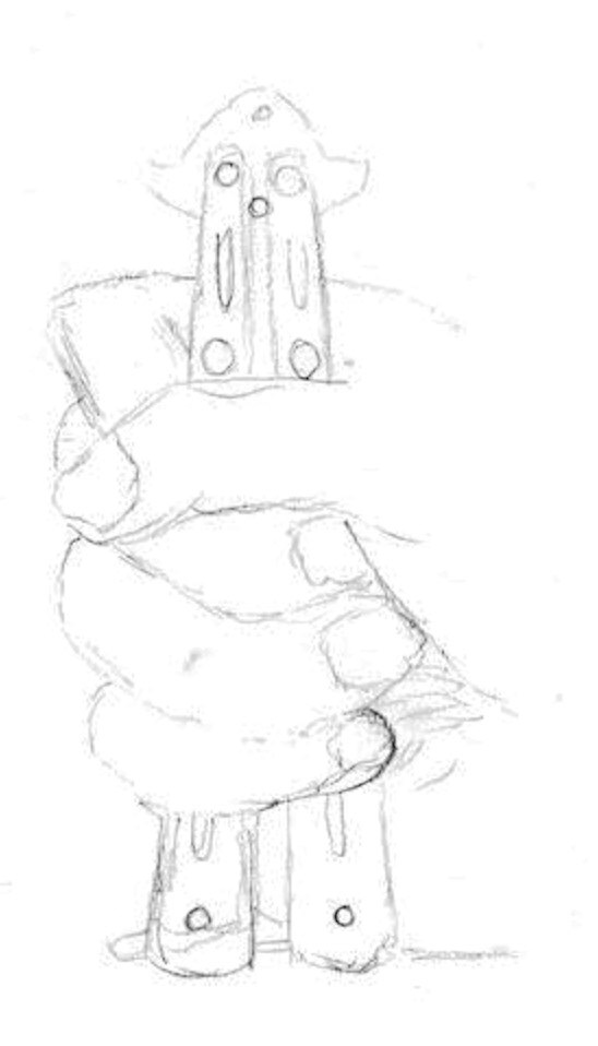
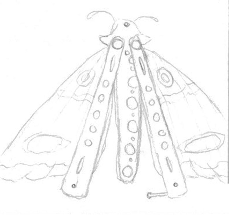
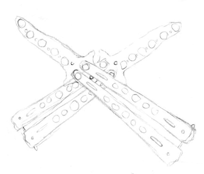
The next step in creating this icon involved scanning and transferring pencil sketches into an Illustrator document. These sketches were then traced and refined, resulting in four potential directions for the final two icon submissions.
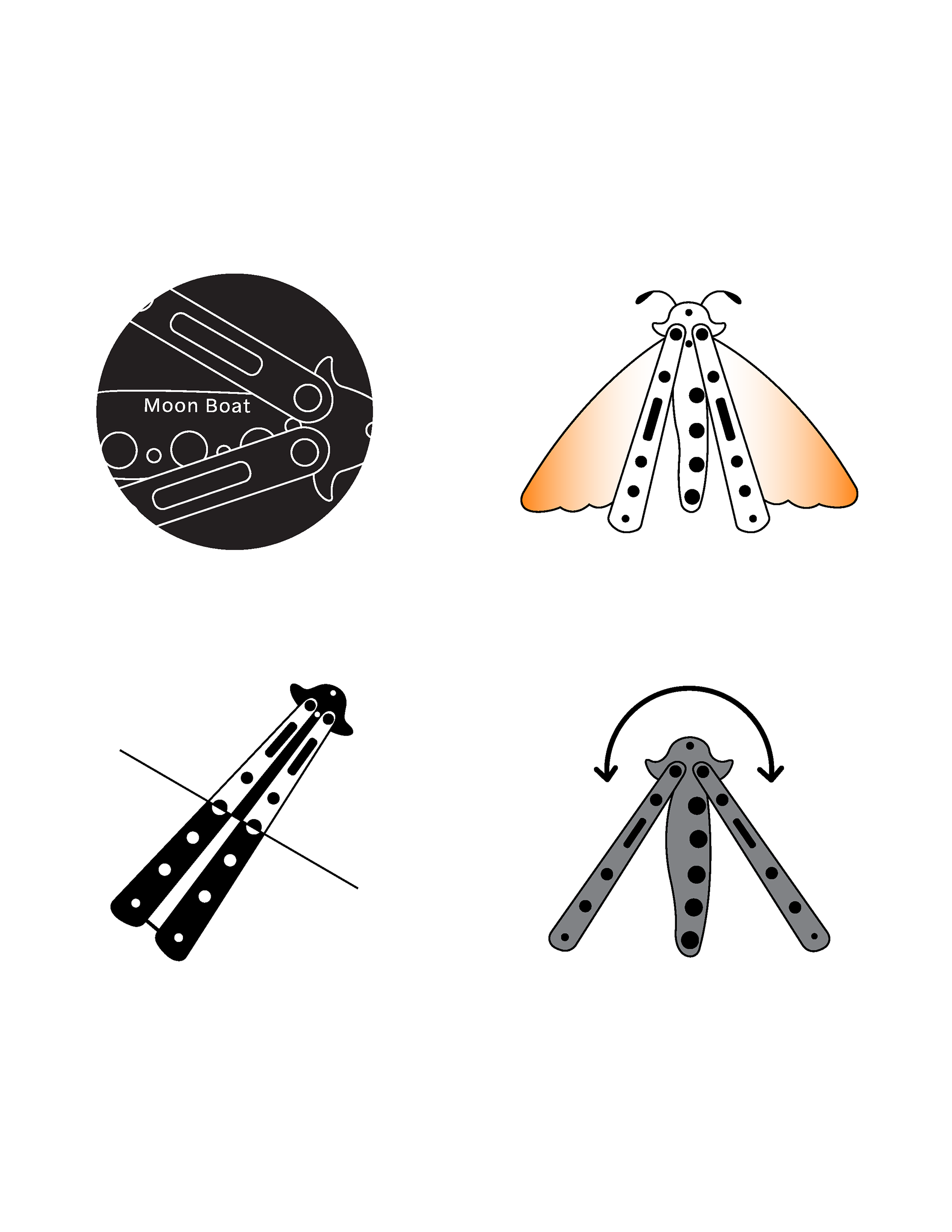
The final steps of the iterative process moved toward a more in-depth exploration of two specific icons that were deemed most successful. Variations of color and line weight were applied in order to determine the most effective outcome.
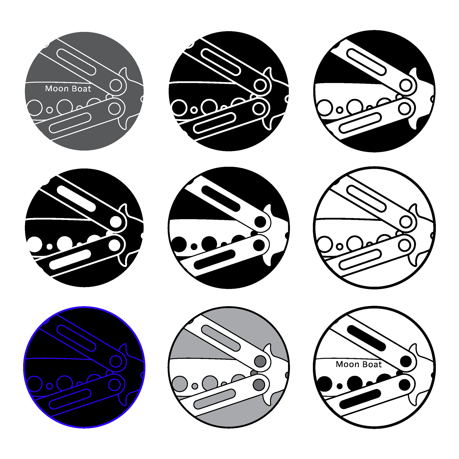
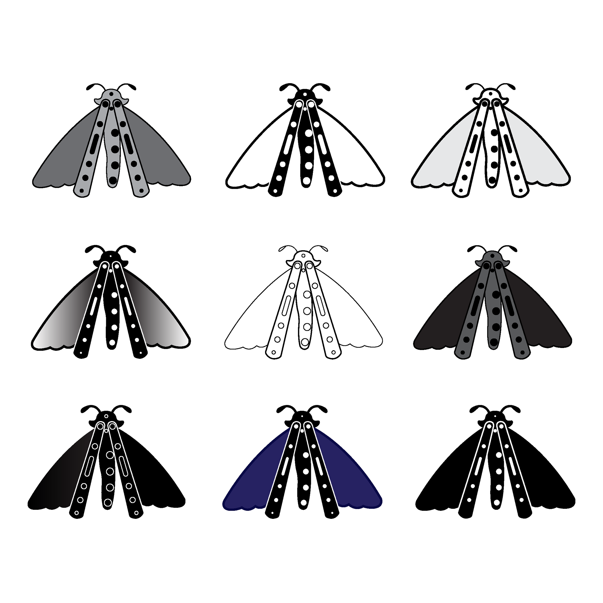
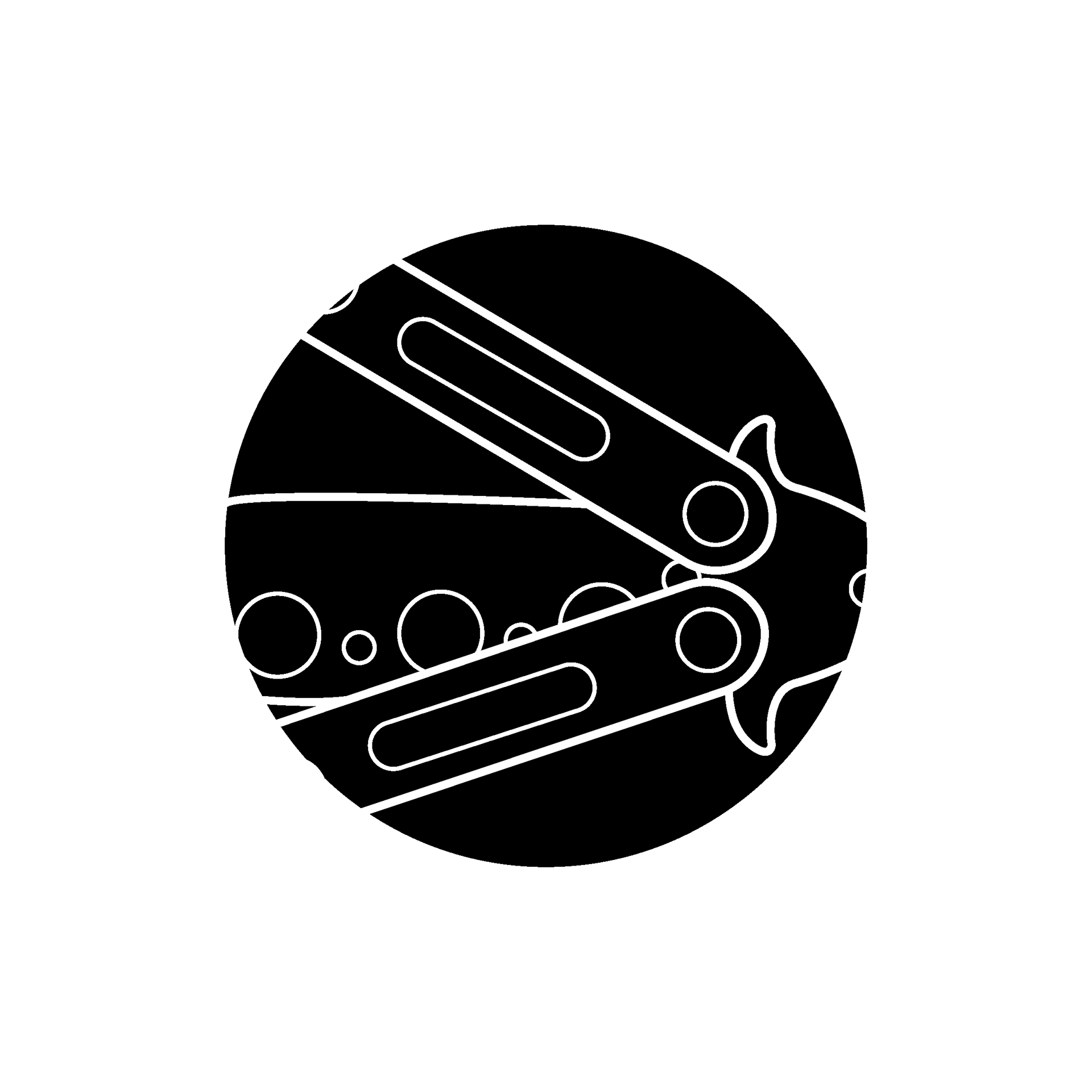

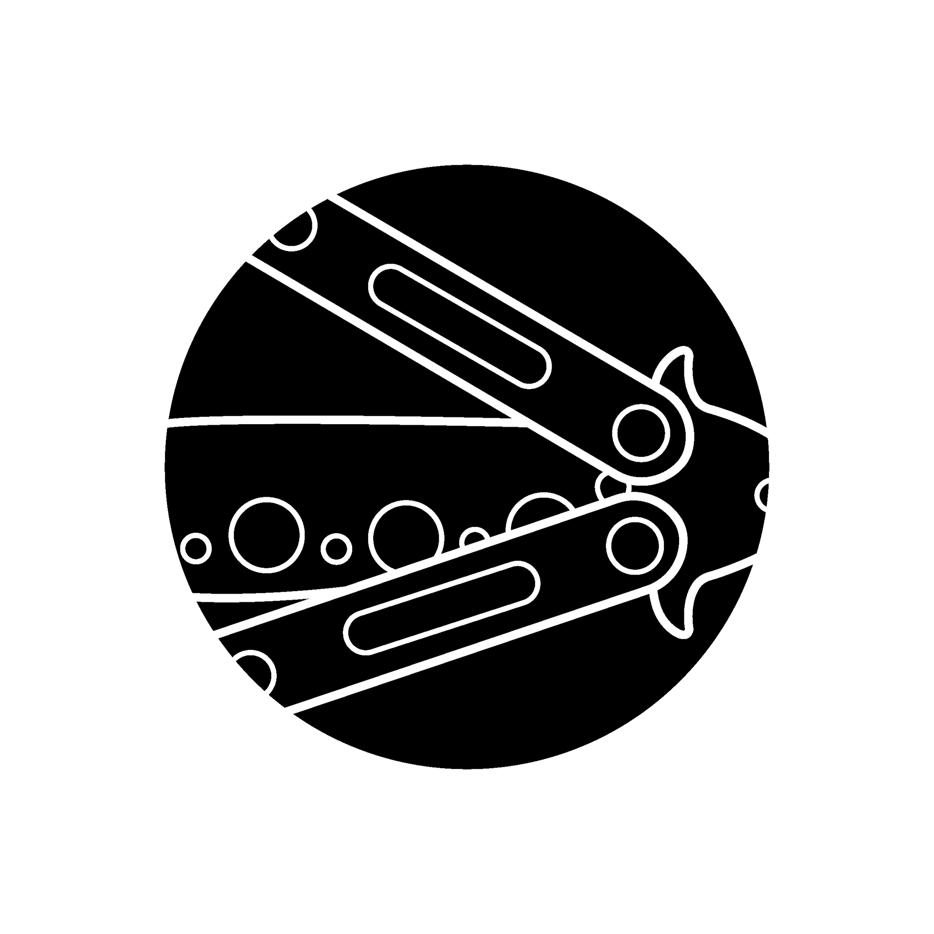
During a structured critique by peers at the University of Cincinnati, descriptive feedback was provided on potential improvements to the final icons. For the icon pictured on the left, attention to cropping was recommended to avoid unwanted tension. In order to improve the icon on the right, it was suggested that the 'butterfly' features could be more fully embraced with refinements to the antennae and wing color.
FINAL ICONS